Creating Cards: Next Step After Prototype
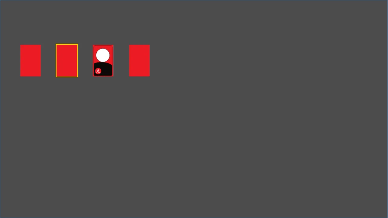
Card implementation screen
Now that I’ve created the prototype, it’s time to start real development. Let’s begin with the smallest unit. I’ll start with the Card, the minimum unit of the entire game. First, let me organize what happens with a single card.
Cards have a front and a back.
The front shows numbers 1-10. Each number has 2 different designs.
Cards can be selected and hovered.
Cards can move.
With these definitions, I created a Node2D in Godot. The root is a Node2D called CardView. I attached FrontSprite, BackSprite, and BorderSprite as children. To handle clicks, I added Area2D and attached CollisionShape2D underneath it. With this combination, the basic skeleton of CardView is complete.
Script and Data Structure
I attached a script to CardView. First, let’s look at the card data.
number: 1~10
card_type: normal | special
Example) 1-gwang is special, normal 1 is normal
is_face_up: front/back state
I also separated state values.
is_clickable, is_moving, is_hovered, is_selected
When is_clickable is true, hover/click events are bound. I created three signals: card_clicked, card_hovered, card_unhovered. These signals are emitted when each event occurs.
Child node references are also held in the script.
front_sprite, back_sprite, border_sprite
click_area, collision_shape
Border and Shader Attempt
The border color changes based on selection/hover state. I handled this by dynamically creating textures and inserting them into border_sprite. Originally, I wanted to do this cleanly with shaders but failed. I’ll explore this more and apply it later.
Animation: Flip and Move
I created two functions: flip and move_to. Animations are implemented with tween, and I used is_moving as a guard to prevent interference during playback. This prevents other inputs from coming in before the animation finishes.
Input Event Binding
Mouse events are connected to click_area.
mouse_entered.connect(…)
mouse_exited.connect(…)
input_event.connect(…)
I defined all actions that happen on the card like this and created a test scene to verify. Testing in small units makes the functionality clear at a glance and seems easier to manage later. Of course, the structure might need to be overhauled as the project grows. I’ll make that judgment as it grows.
Test Video Notes
Card behavior test video
The first card is not clickable. No hover or selection possible.
The second card is selectable.
Hover displays hover border.
Selecting it fixes a yellow border. The hover effect is turned off at this time.
The third is connected to flip action.
The fourth is connected to move action.
All animations have time, easeType, and transitionType extracted as constants. Values can be changed immediately for quick tuning if needed.